Your customers’ first interaction with your business will likely be through your website. As such, making a good first impression with engaging and useful information is essential to get them interested in your products and services. However, the goal is to keep prospects engaged and interacting with your website, eventually propelling them to take action and invest in your product. The best way to achieve this is to ensure that your website is seen as a valuable resource that is easy to navigate. Here are the best practices and key elements that can elevate your business intelligence (BI) or data analytics website.
Basically, you should be asking yourself if a lay person looking at your website would be able to immediately understand what you offer. If not, here are the core elements to make sure you achieve this.
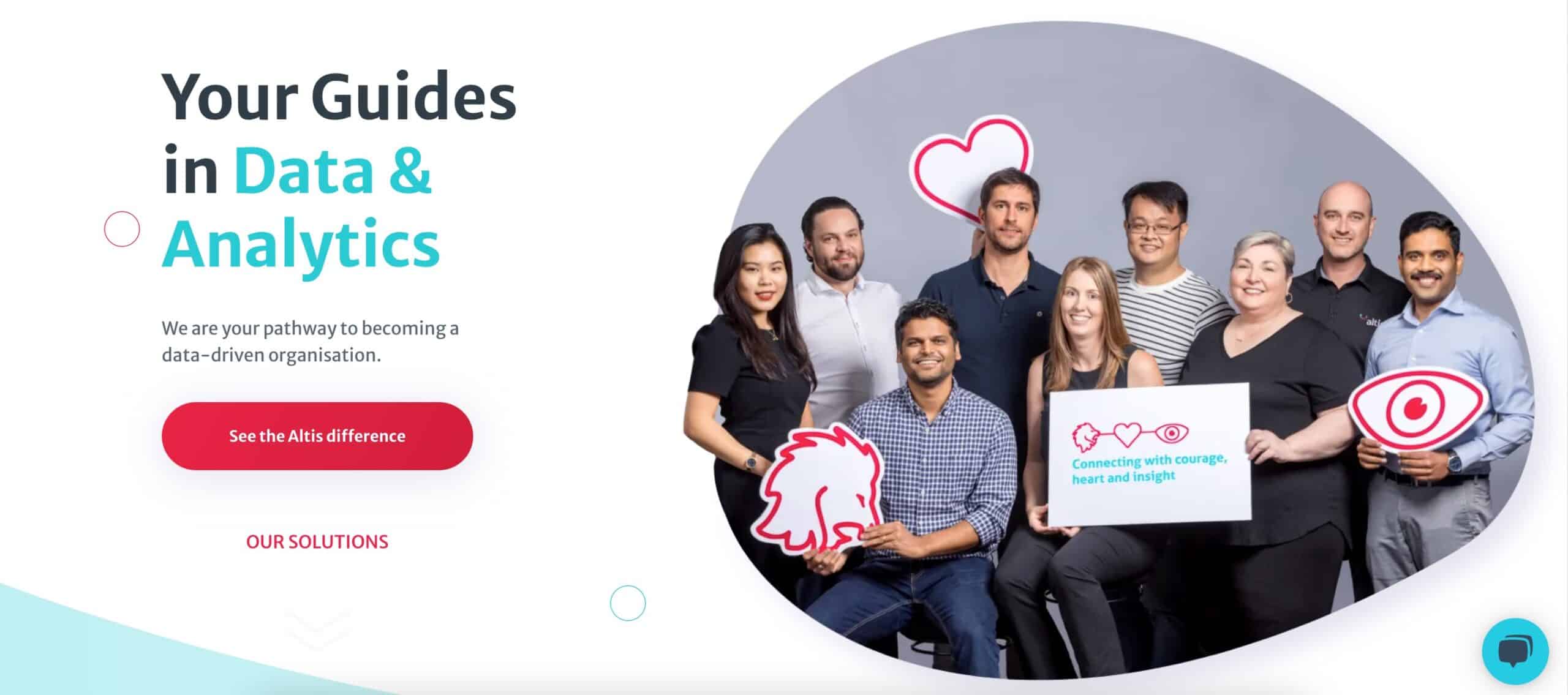
Your heading and subheading should spell out what you offer and demonstrate to the audience how their life will get better or what benefit they will derive from working with you (i.e., answer questions 1 and 2 of the “grunt test”).
The main heading should include your service keyword (i.e., what you do); for example, power BI consulting and training, or data and analytics consulting. This makes it easy for people to understand your core service offering and has the added SEO benefit of driving new visitors to your website who are searching for those terms. For your subheading, you should elucidate the benefit to the audience, as this is critical if you want to connect with users. A common mistake many data analytics and BI websites make is to only answer the first question, “What do you offer?” without elaborating on who it helps and the benefits they should experience. Or worse, simply including a bland statement like “Opportunity in Data”.
This directs users to take the next step. It is important to show the primary thing you want a visitor to do, such as contacting you or scheduling a consultation. If possible, avoid generic phrases like “Contact us.” Instead, include something more compelling that relates to the service you provide or how your audience will benefit; for example, “Make data work for me.”
Having a secondary CTA is an effective way of building rapport with someone who is not ready to engage with your website just yet. This can be done by directing them to your about page, a case study, or other pages where they can further familiarize themselves with your organization.
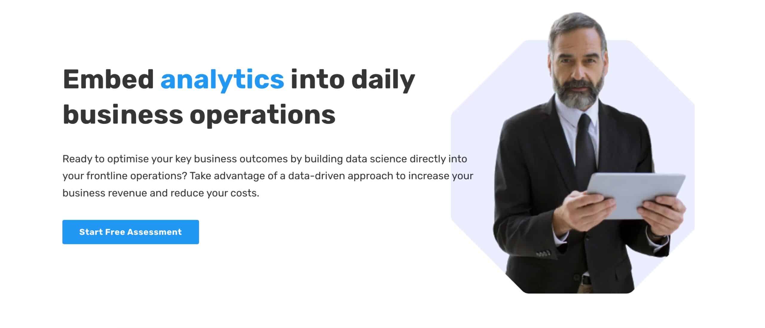
Making an impact above the fold with strong supporting imagery that complements your heading and subheading or creates a personal connection is essential. Data analytics and business intelligence websites often lack the personal connection that other types of websites have. By showing images of real people — your team — as opposed to generic stock photos, you can help differentiate your organization and connect with potential customers.
Besides showing your logo and primary call to action, your top menu is key to helping users find the information they are looking for easily. As there are probably several things you want to show your audience — services beyond data consulting and report visualization or information about your company — having a simple top navigation menu with well-organized, nested mega menus can help you strike the balance between keeping your header clean and simple and letting users explore everything you do and provide.
Check out these websites for good examples of a simple top menu with nested, well-organized mega menus:
Consider implementing the following elements to clearly and succinctly expand on how your service works. Examples of segments and elements to include are approach/methodology, service pages, engagement process, and contact information.
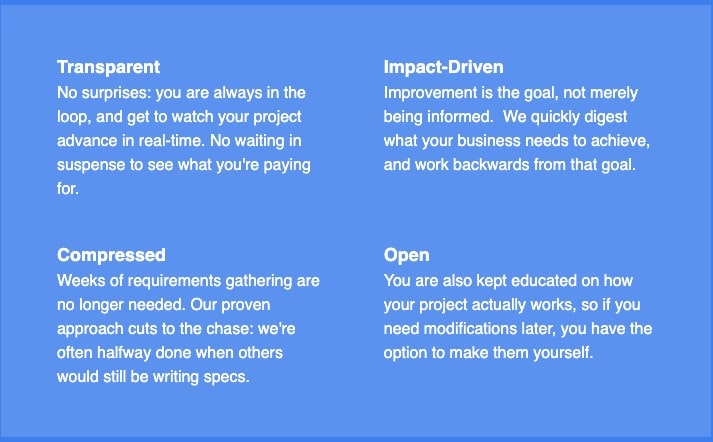
Your approach to helping clients is another area where you can differentiate yourself from other BI or data analytics websites. Simplifying high-level details with visuals or graphics can help prospects quickly understand what working with you would be like and encourage buy-in to your way of solving their problem.
Check out these examples that illustrate the approach of various companies:
Dive deeper into your services by having a separate page on your website for each of your service offerings, such as BI portals, dashboarding, power BI consulting, tableau consulting, power apps development, etc. This is important if you want to show up in search results — search engines are constantly crawling and analyzing site content based on the relationships between these keywords, so it’s difficult to rank for a keyword if it’s not included on your site.
In addition, each page should have depth, useful details, and at least 800 words. There’s no point creating lots of service pages if they’re too short to show up in search results; if users do end up finding them, they won’t be convinced if the page doesn’t answer their questions or address their potential objections.
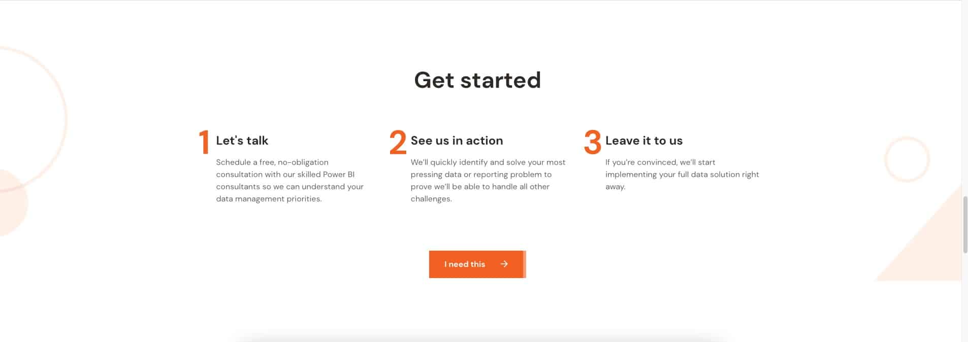
Customers love it when you spell out what you’d like them to do in simple steps. Include a section on your website that states how your customers can do business with you in a simple three-step process.
Here’s a good example:
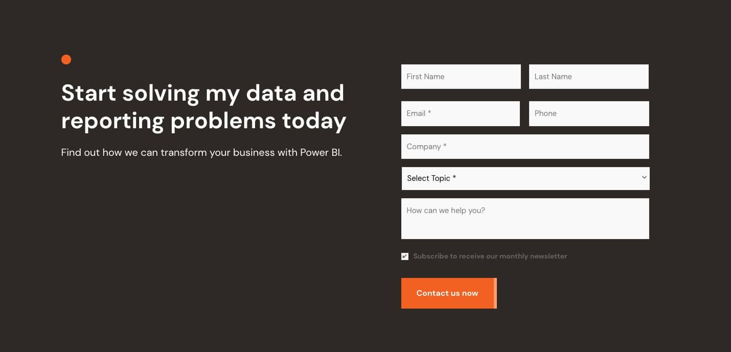
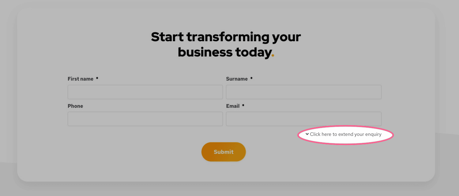
Make it easy for your customers to get in contact with you. Your form should ask for the least amount of information required to complete the transaction or qualify a lead. To achieve this, the layout of your input fields should be as simple as possible. If you have various service offerings, such as consulting, training, and data warehousing, then including a drop-down menu can help streamline your engagement process.
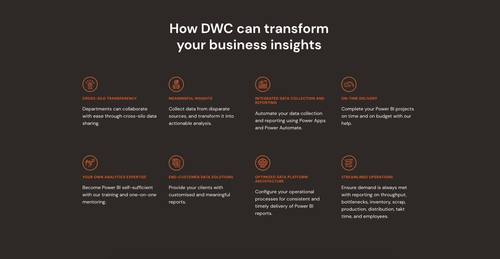
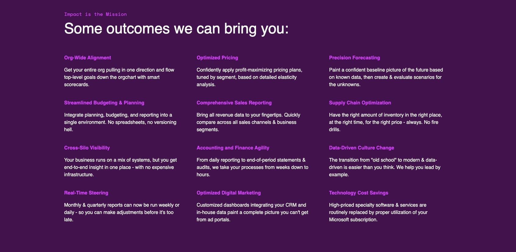
By clearly and succinctly explaining who benefits from your services, your prospects will have confidence that you know exactly how to meet their specific needs. Examples of segments to include are: features and benefits, problems and challenges, roles and use cases, industries served, and value propositions organized by business or department functions.
Detail how your BI or data analytics solutions can deliver business value to your prospects.
Here are some good examples:
Elaborate on what’s in it for the customer when they make use of your services. Benefits can range from the time people will save to the transparency they will get when working with you. Effective ways to highlight your value proposition are to use icons, images, bullet points, or a few short, impactful sentences.
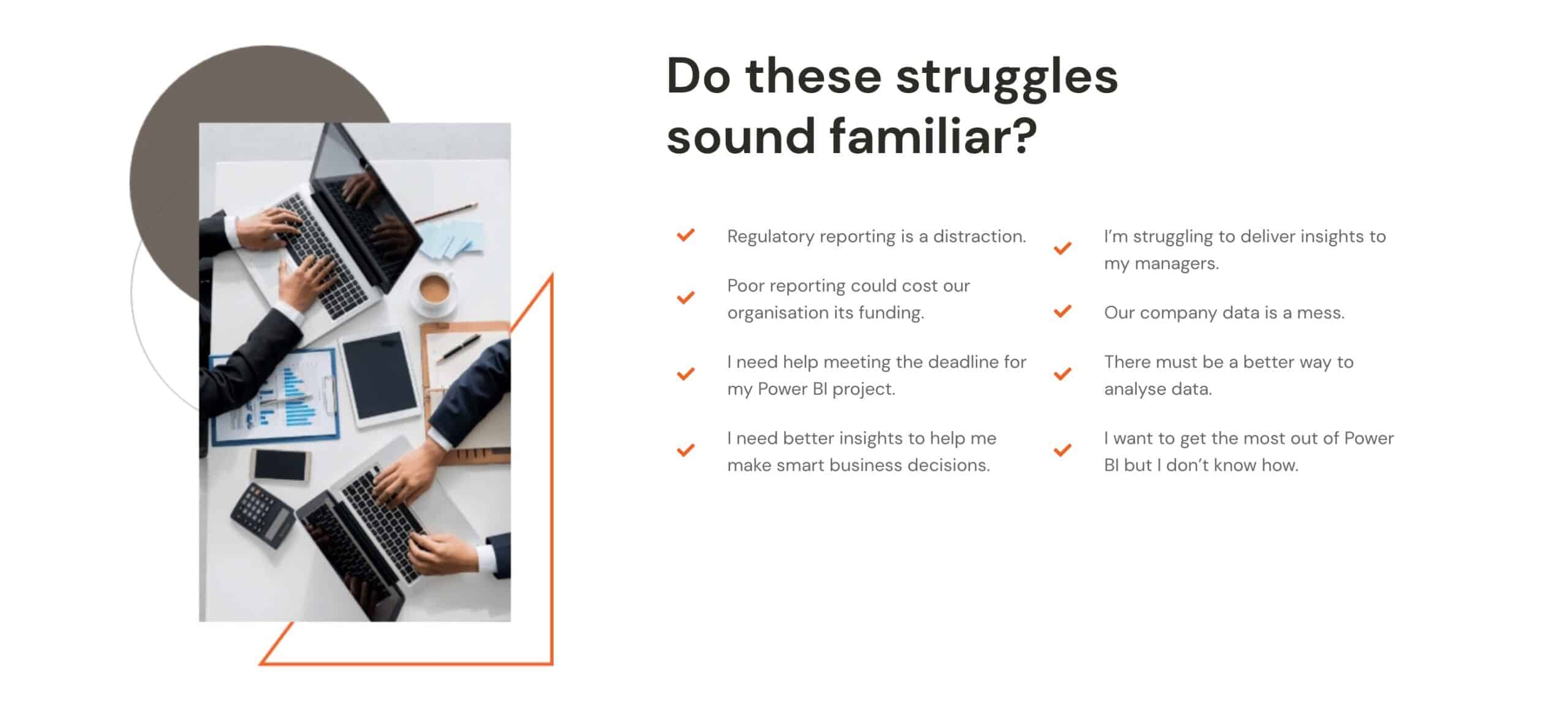
Highlight the key challenges your target audience typically faces. This shows that you know the problems they are facing and makes it clear that you can help. You want prospects to think “This company gets me!”
Here, you should highlight the specific roles/positions that benefit from your services and include a brief description of the positive transformation they can experience with your help. As a BI/analytics company, you may help a variety of people with all kinds of different needs — from developers to IT leaders to sales managers — and it’s important that your customers know this. Being specific demonstrates that you are intimately aware of the variety of problems that people in different roles face, and you know how to solve them.
Create separate pages on your site for the main verticals you focus on. Not only does this highlight your ability to work within a specific field that might have certain data analytics or BI requirements, but it also makes it more likely that you will rank for important keywords like, for example, “healthcare data consulting.”
Check out these examples of industry-specific pages:
Create separate pages on your site for the solutions you provide by department/business function. This highlights your ability to help distinct segments of your customer base who might have specific BI/data analytics requirements. For example, people working in human resources have vastly different data and BI requirements than people working in marketing or finance, so demonstrating your ability to cater to various audiences is imperative.
Check out these examples of business function/department-specific pages:
Since your goal is to convince your prospects that you are the best choice to do business with, including content that establishes trust with them is essential. Here are a few ways to achieve this.
This can be done quickly and visually by including the following content on the homepage, which should be prominently featured and immediately accessible:
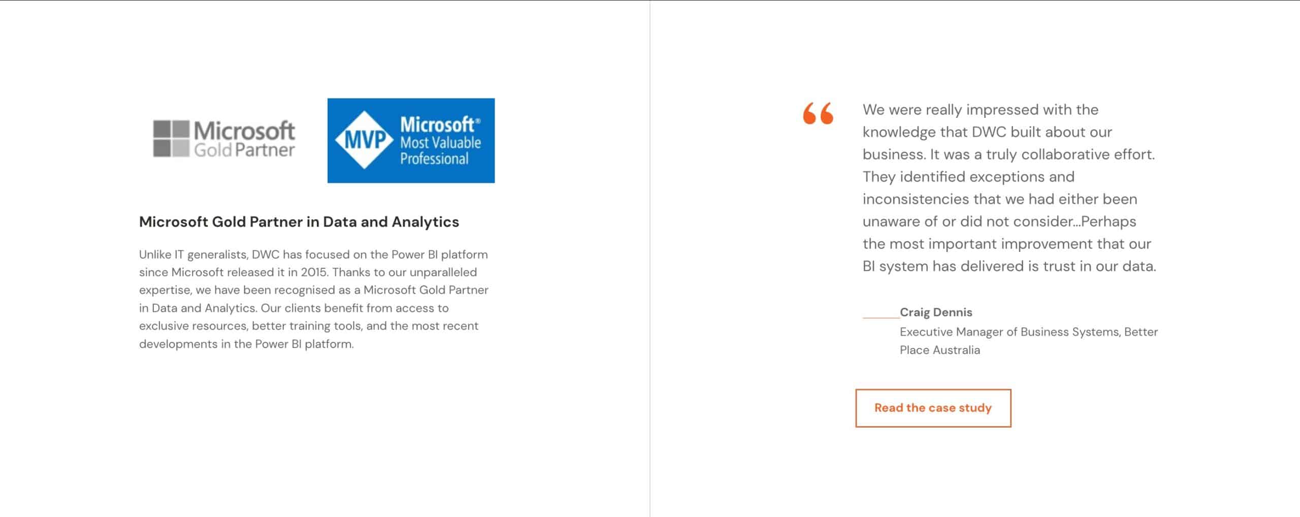
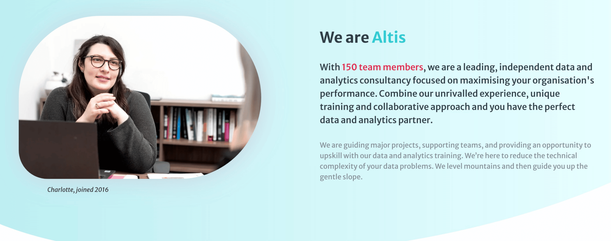
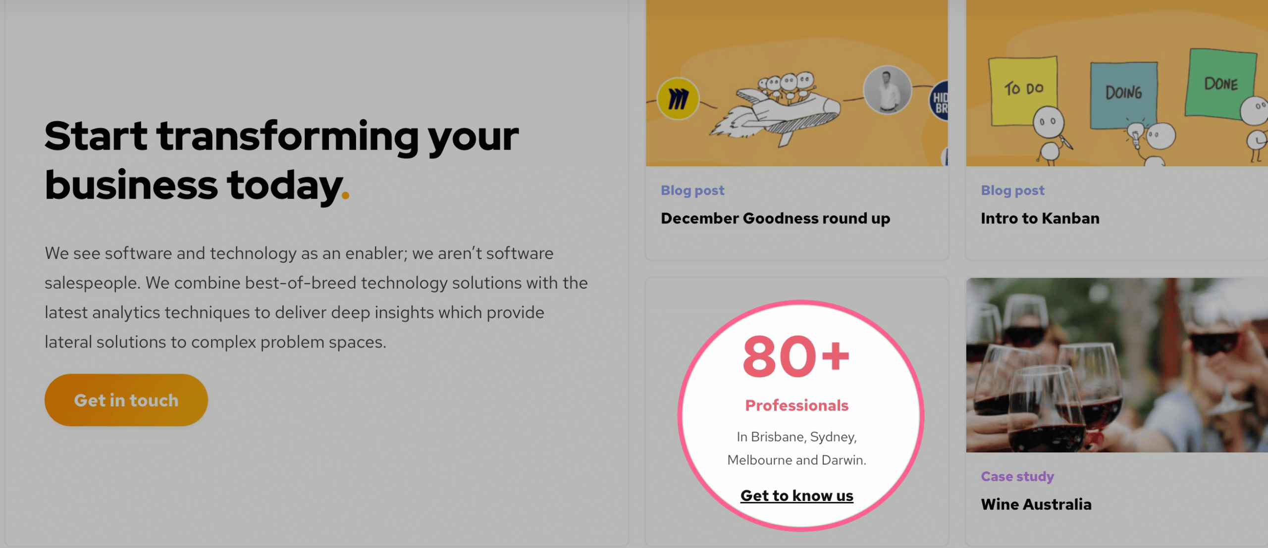
Add more credibility with numbers and figures where it makes sense, for example:
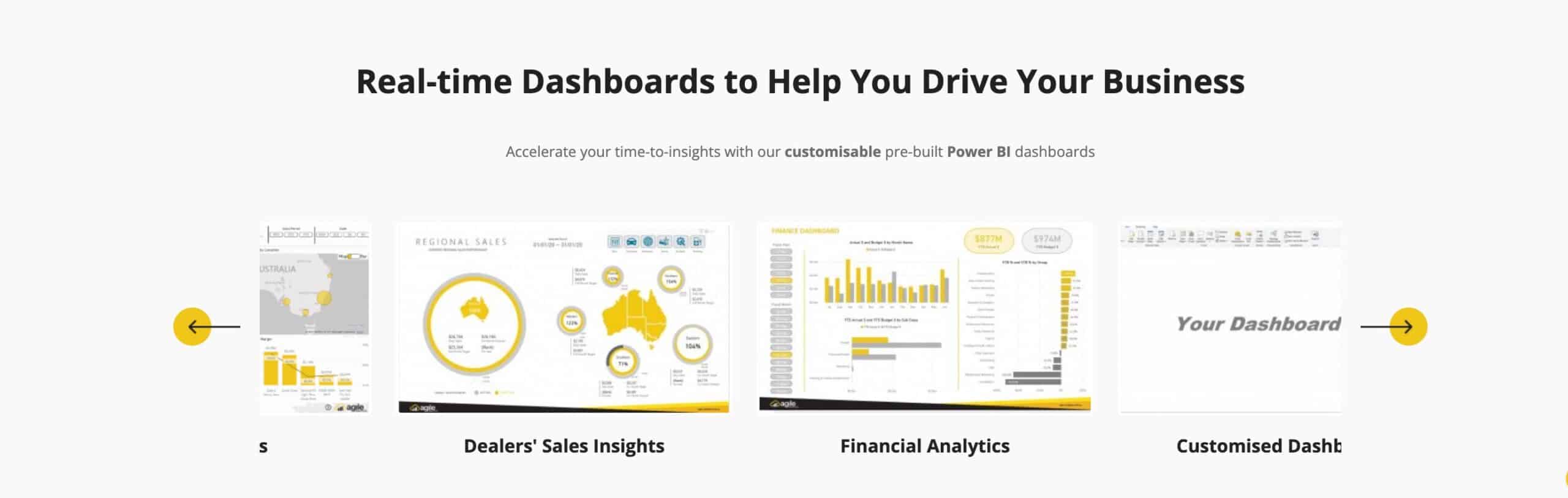
Create a gallery of dashboards or feature dashboards on relevant pages to demonstrate the impressive dashboards that you’ve created for clients in a variety of industries or business functions. This is another trust-builder that can help nudge visitors toward conversion.
Check out these examples of resources that educate and answer questions that a prospect might have:
One way to ensure you have an endless stream of content ideas is to make sure that you note down every question or concern a prospect has. This will become your repository of content ideas.
In addition to the above-mentioned elements to include in your website, here are some general best practices for a positive overall user experience.
Doing the basics right is key, and how you organize your content is one of the most basic elements that websites tend to get wrong by overcomplicating things. Make sure the content is presented in a clear and logical order from the top left to the bottom right, and that you use short paragraphs and lots of formatting so that your text is easily scannable.
Create a footer section at the bottom of your page so you can feature links without cluttering up the rest of your page. You might have a number of links on your BI/data analytics website that are not really essential to feature in the top menu or the homepage. By moving these to the bottom of the page, your entire website is more streamlined and easy to understand.
Now that the website essentials have been covered, here are a few tips on what not to include.
Although these may seem like they’ll make your site stand out, they are, in fact, bad for usability. Most visitors will read your headline and begin scrolling, not even seeing your second or third slide. In addition, it may also have a negative impact on SEO due to the use of multiple H1 headings, so you’re better off just having a powerful headline with a clear call to action.
These are to be used only as a last resort, as they usually feel inauthentic. Also, seeing the same picture over and over on multiple websites can be an unpleasant experience for users.